

This month I was lucky enough to photograph Renzo Piano’s first finished UK building, Central St Giles, located directly behind New Oxford Street in the shadow of Richard Seifert’s Centre Point and opposite the historic Angel pub and Henry Flitcroft’s Palladian church on St Giles High Street in Central London. Built on the site of an old MOD office block, the new building is incredibly bright, multi-coloured and designed to rejuvenate an area that previous had only two contributions to popular culture, leprosy and alcoholism. In 1101, Queen Matilda founded a leper hospital and colony at St Giles, causing a social stigma that plagued the area for centuries. The term “off the wagon” meaning someone returning to drinking was coined when the condemned on their way from Newgate Prison to be hung at the Tyburn Tree were allowed off their prison wagon for a last beer at the Angel Pub and William Hogarth’s famous engraving Gin Lane depicting a drunken mother in the squalor of an 18th century London slum was also set there.
After such a chequered history Central St Giles couldn’t be more different, the external facade of the building is broken up into 13 vertical colour-coded panels. The idea being to break up what would otherwise be a very large and boring mass by creating fragments rather than a single whole. This idea has defined many of Piano’s large buildings including the Shard, whose very name is derived from the vast sheets of glass that are to be overlaid onto its surface.
Each coloured panel consists of 134,000 prefabricated glazed terracotta tiles hung, by an internal chassis carrier system, as a decorative veneer. The tiles are incredibly durable and are expected to retain their bold colours forever. The colours themselves were chosen from hundreds of options to work well with each other but also with the local buildings and trees. A full-size panel mock-up was erected on site to test the colours before the final six were chosen.
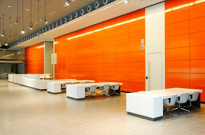
The building was a joy to photograph being beautifully detailed with Piano’s trademark fluency and precision. The external colour scheme and tiles are also echoed inside. The rear wall of the entrance lobby, lift doors, handrails and even the lift displays are colour co-ordinated. The building might not be to everyones taste, but after photographing and studying it extensively I find it amazing.

No comments:
Post a Comment